Systems that ship
Design
Systems
I build the shared layer between product intent and production code: the tokens, components, behavior, documentation, and APIs that let teams move faster without lowering the quality bar.
One Fringe library included 147+ documented component stories, backed by 92% test coverage.
What the system covers
- Tokens
- Color, typography, spacing, radii, and states.
- Components
- Buttons, inputs, dialogs, cards, tables, navigation, and complex product patterns.
- Theming
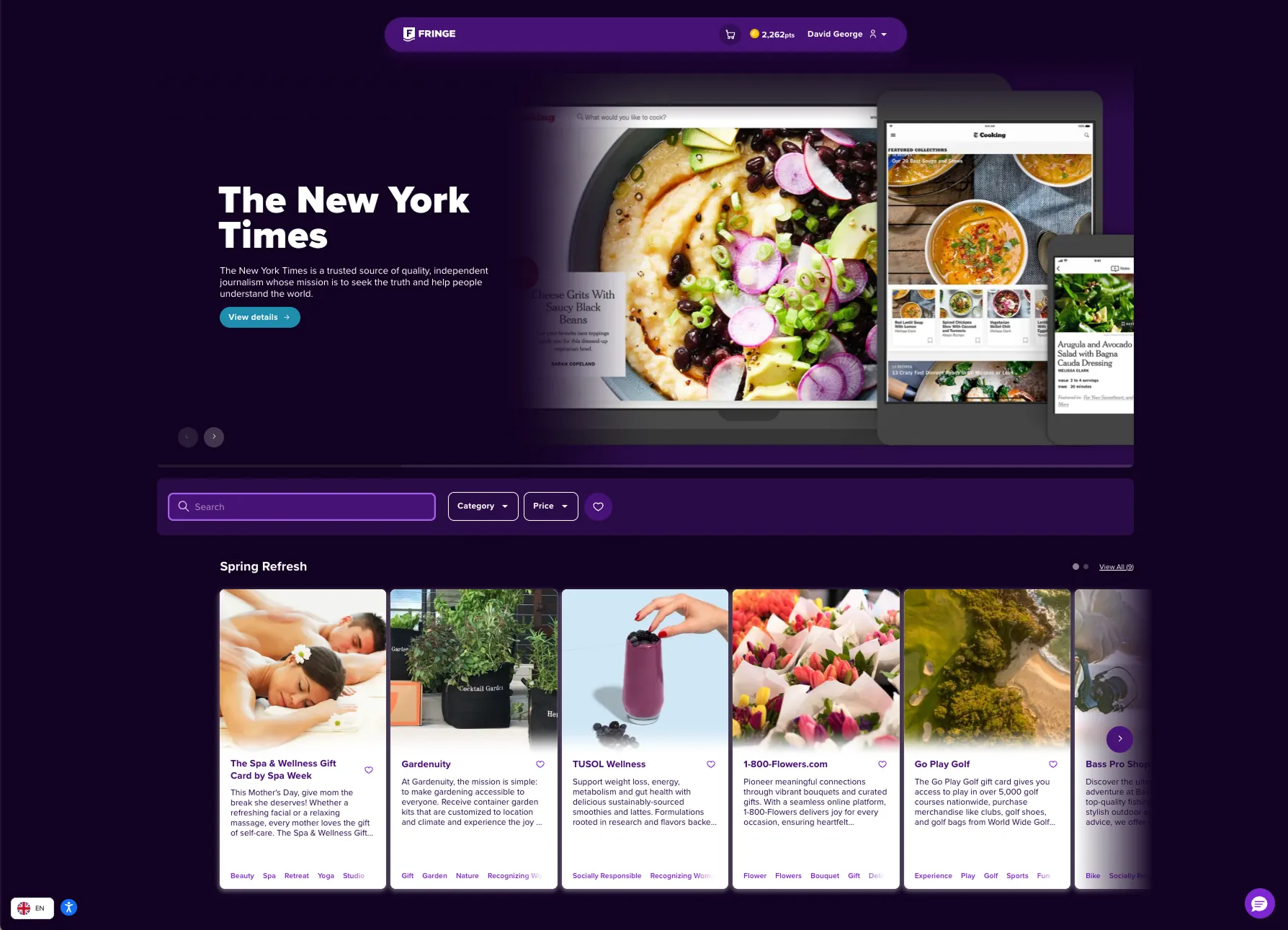
- Brand and rebrand support, dark mode, and variants.
- Accessibility
- Keyboard behavior, focus states, ARIA, and contrast.
- Documentation
- Storybook, usage guidance, browser tests, and working examples.
- Engineering ergonomics
- Clear prop APIs, composability, consistency, and maintainability.
- Design/engineering parity
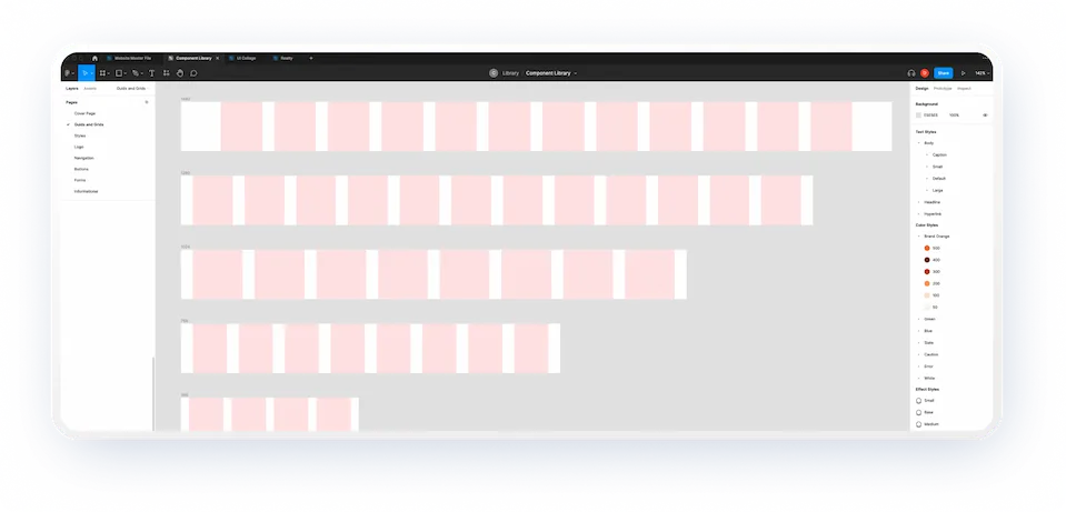
- Figma and production built from the same decisions.
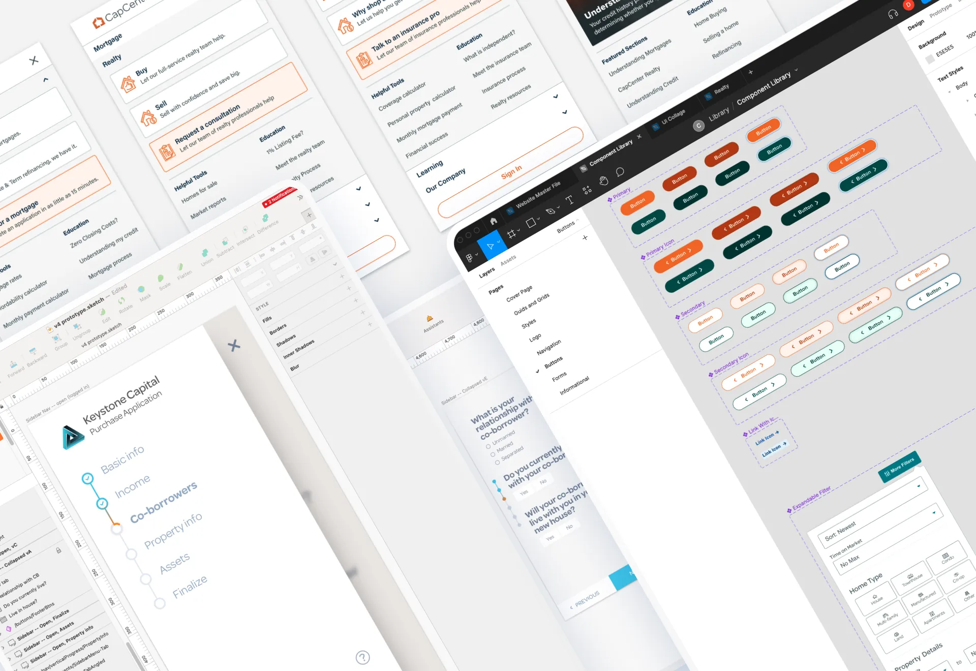
CapCenter component library
Inside the Storybook
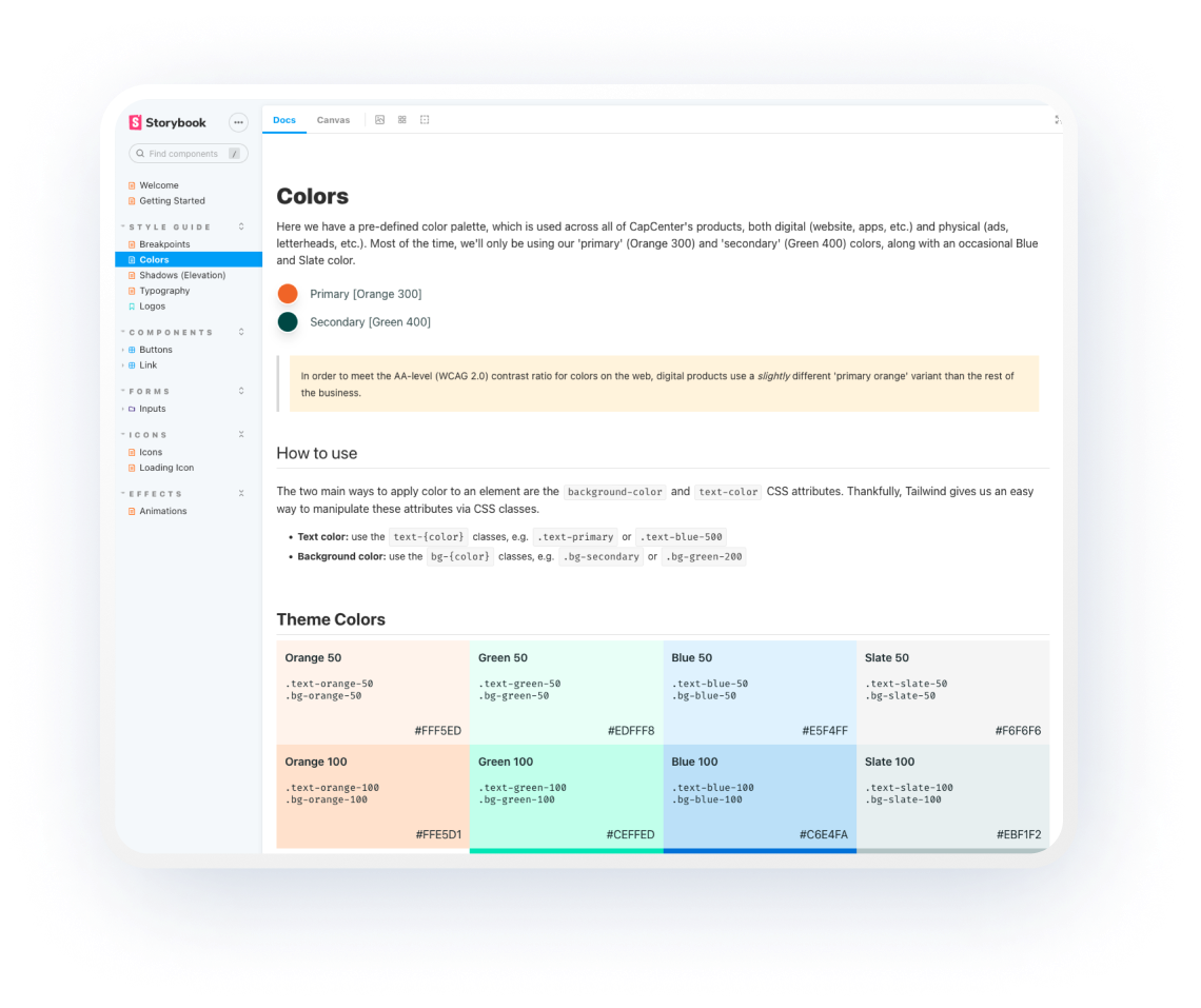
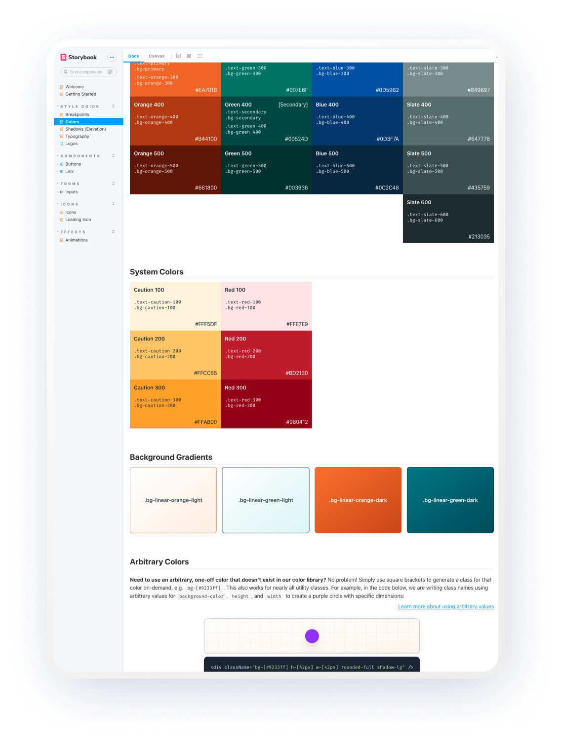
These documentation screens show one of three component library generations I built at CapCenter. The system connected design direction to reusable code, documented APIs, interaction states, and accessibility guidance.
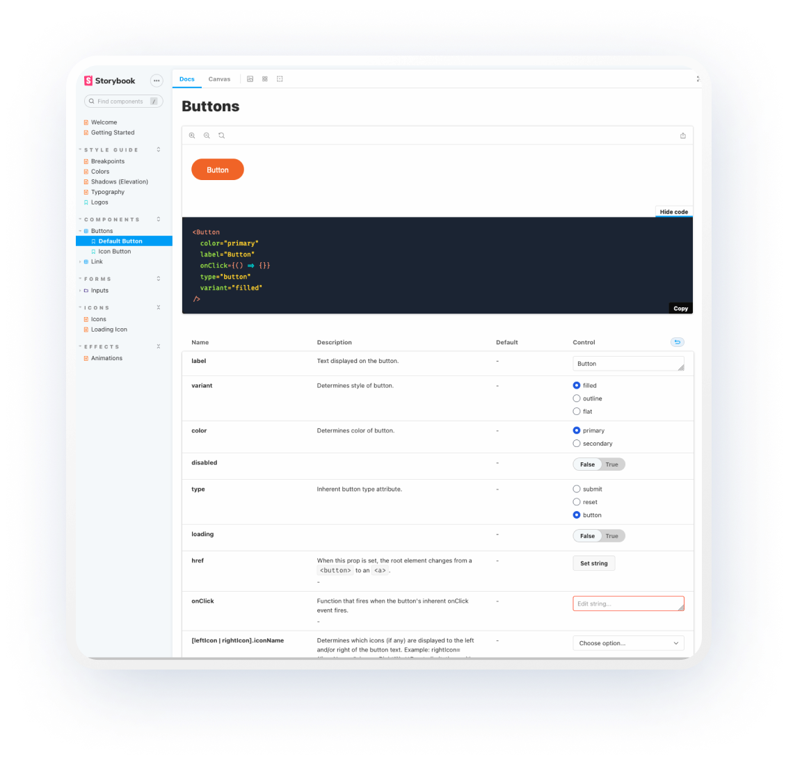
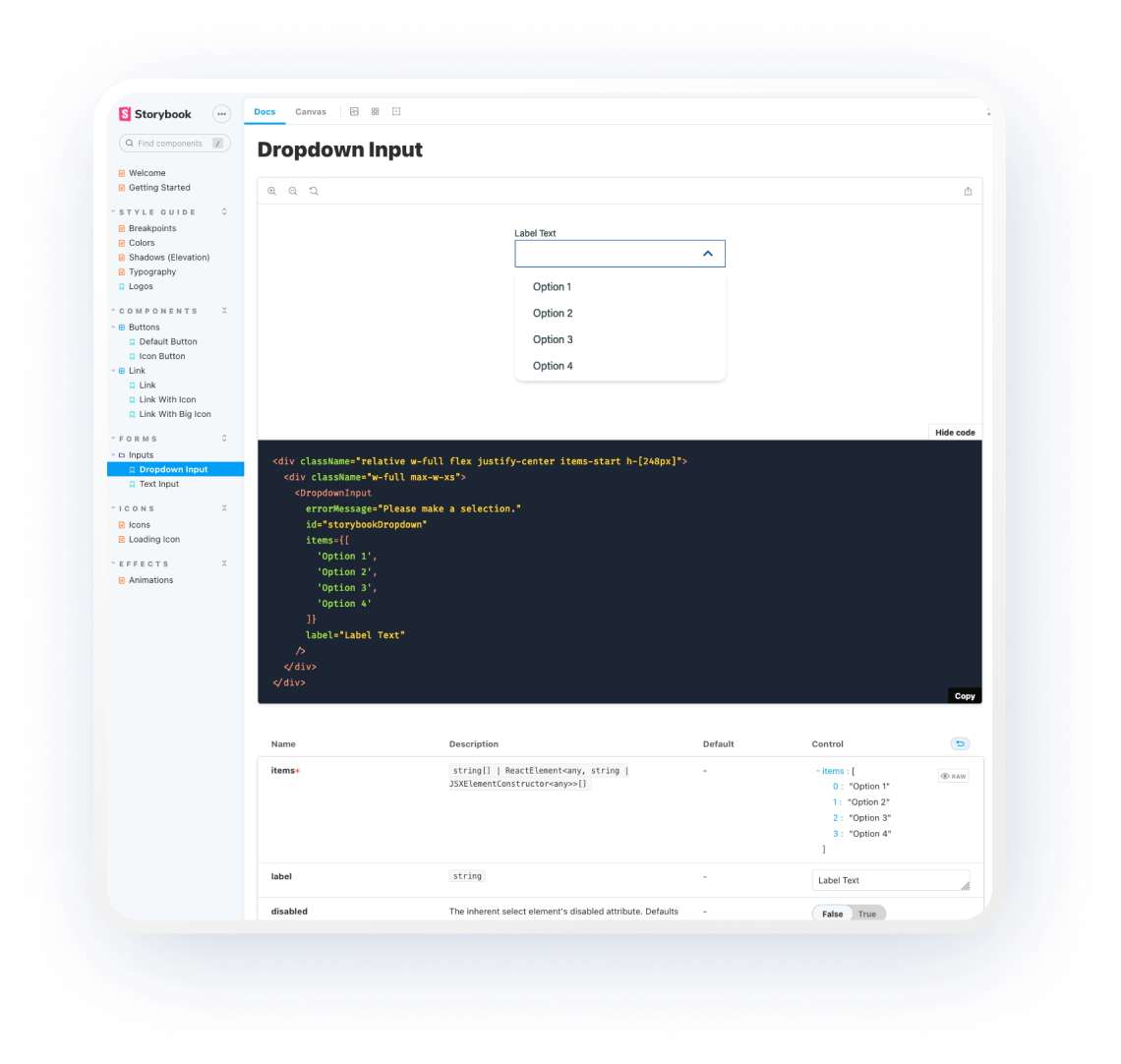
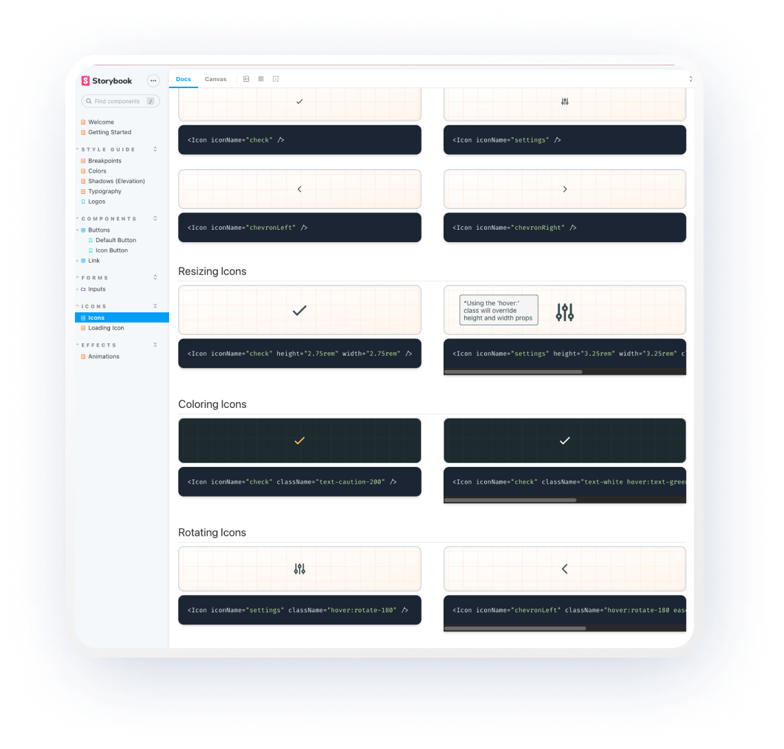
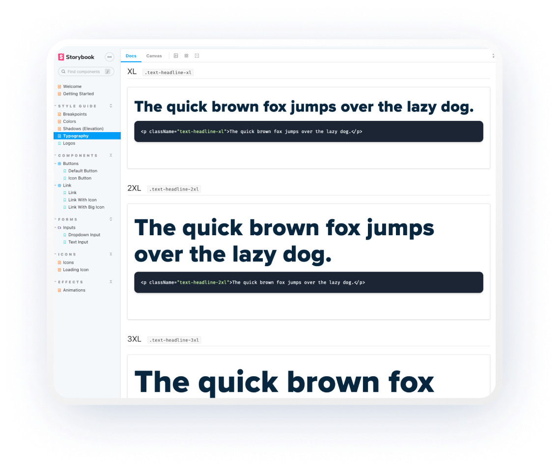
Evidence in the work
Fringe~40% faster developmentShared component architecture aligned across Figma, Storybook, and production.ClarvosRebrand without one-off screensA scalable theming system with Storybook as living documentation. Its modularity allowed it to adapt to 2 different redesigns. On the third, well-defined tokens and components made the transition from MUI to Tailwind seamless.CapCenterPatterns shared across productsReusable foundations for the loan application, home search, and internal tools.San Joaquin CountyAccessibility made repeatableShared components and conventions built around Section 508 requirements.
The system in production
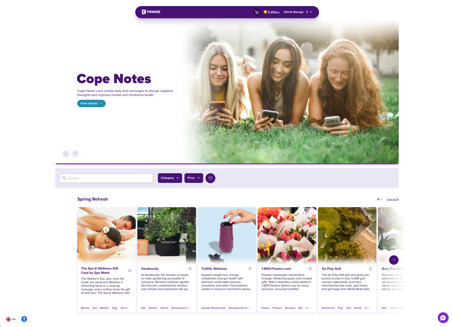
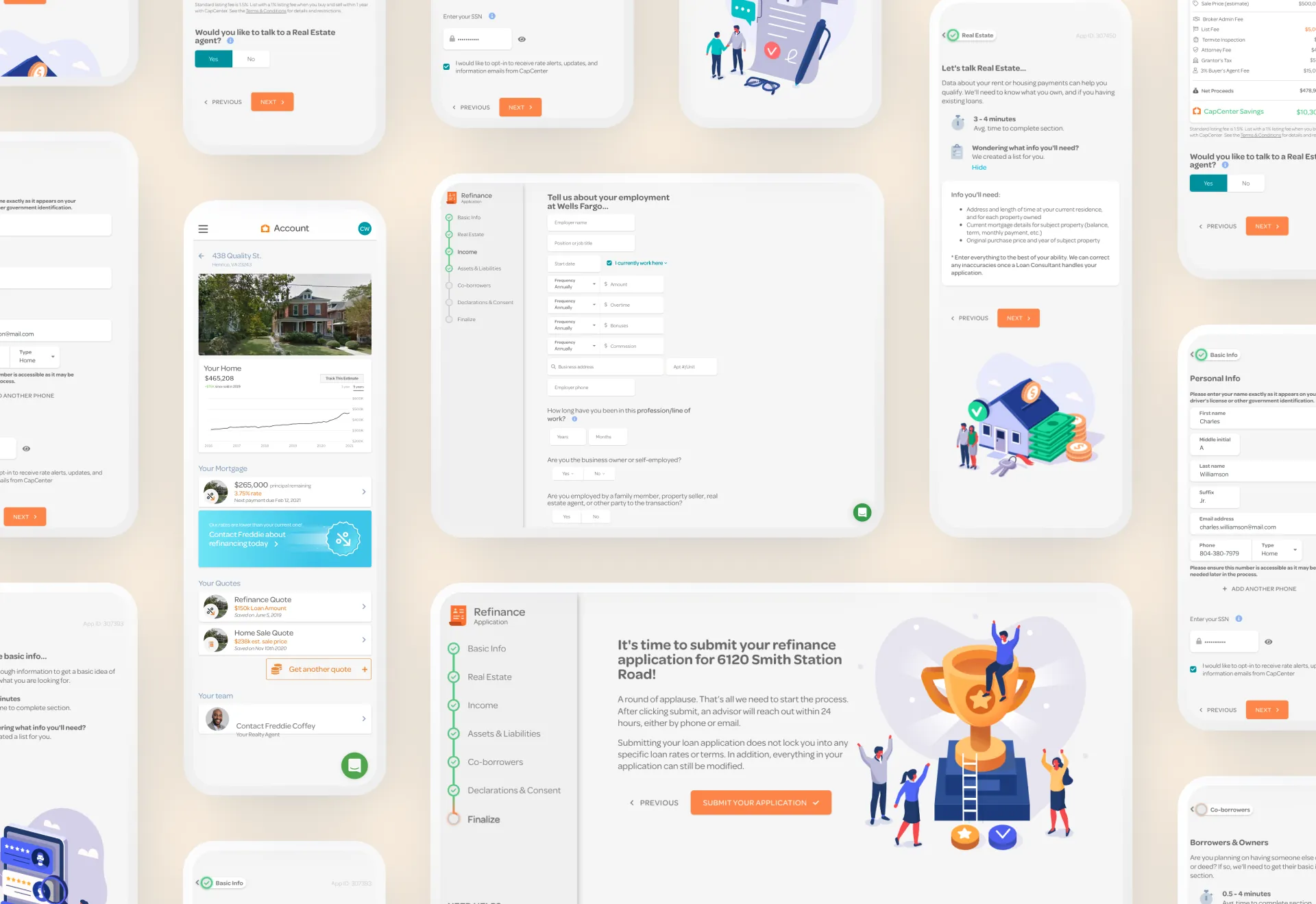
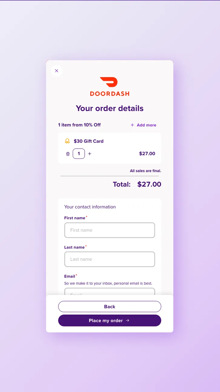
Shipped product surfaces show how the shared foundations held up beyond the component library.